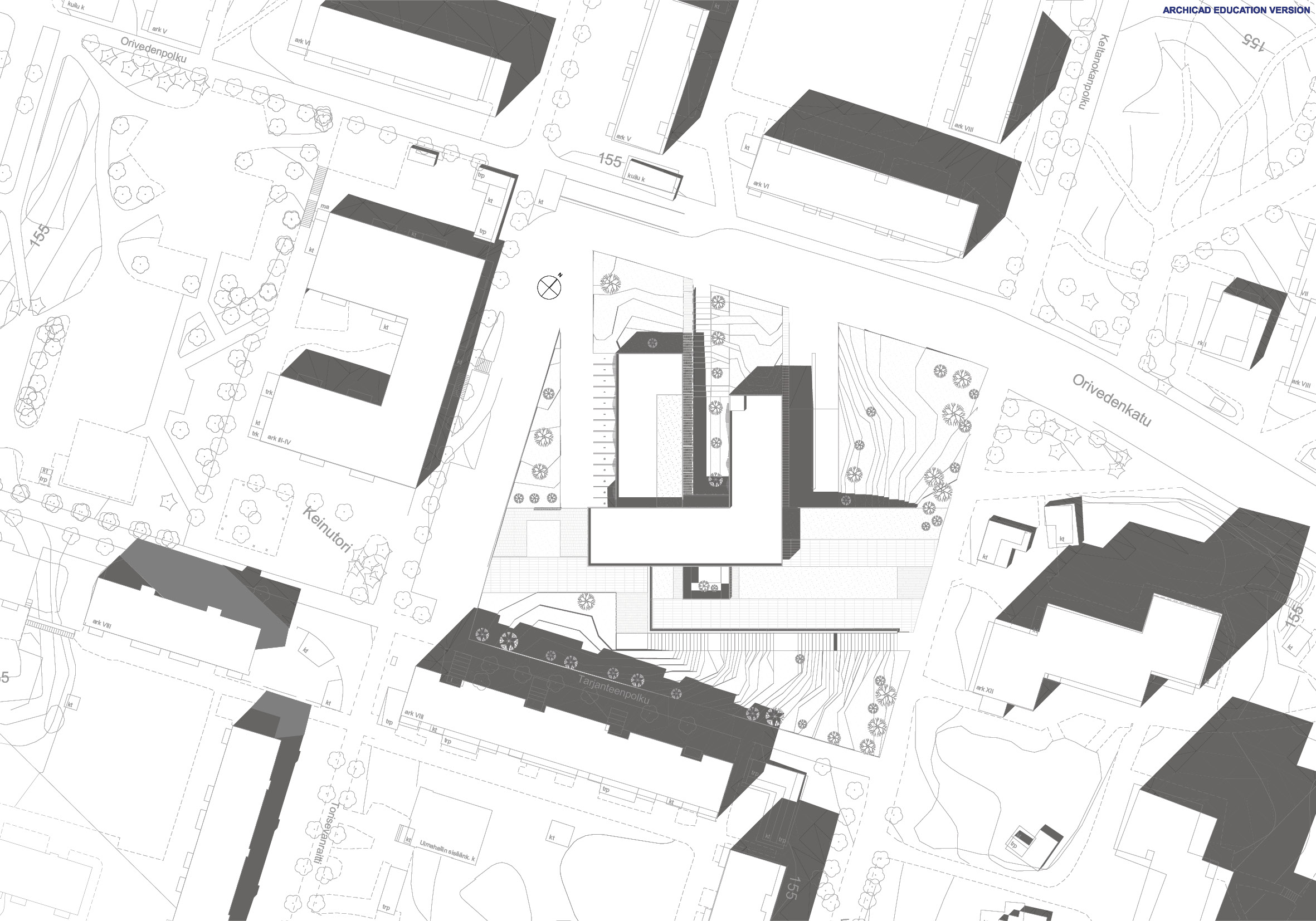
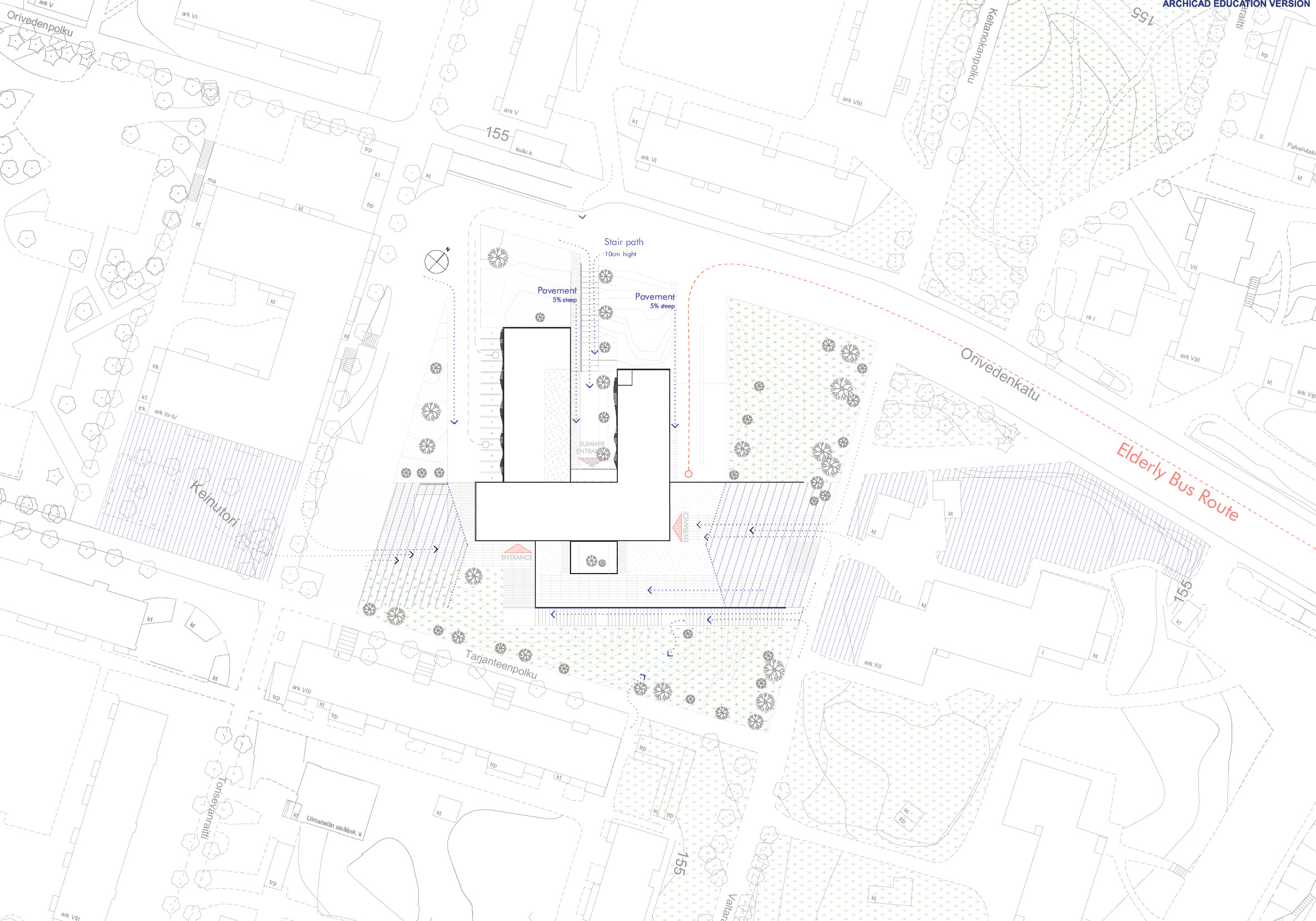
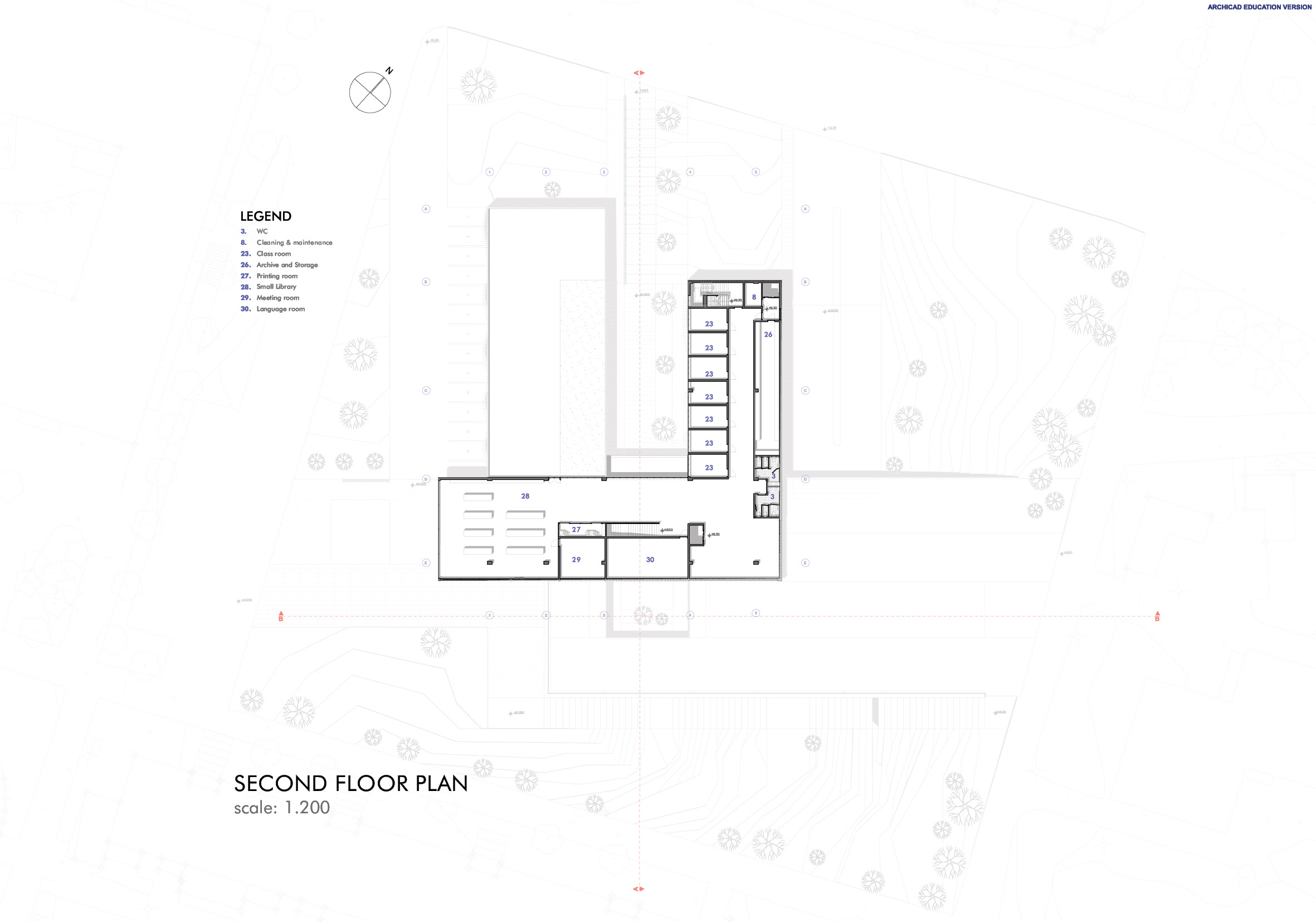
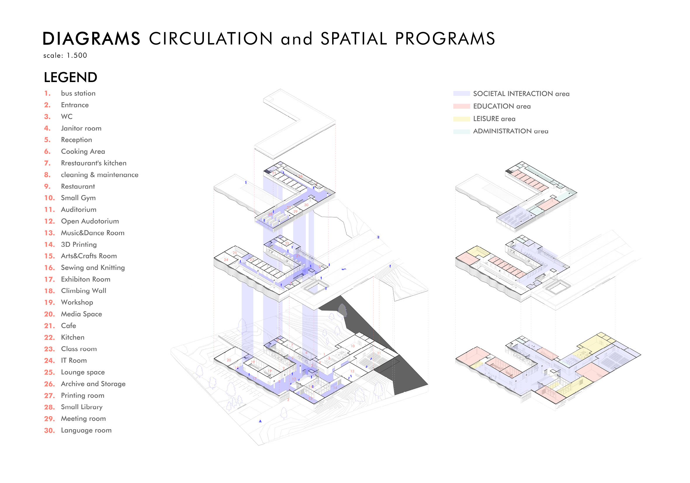
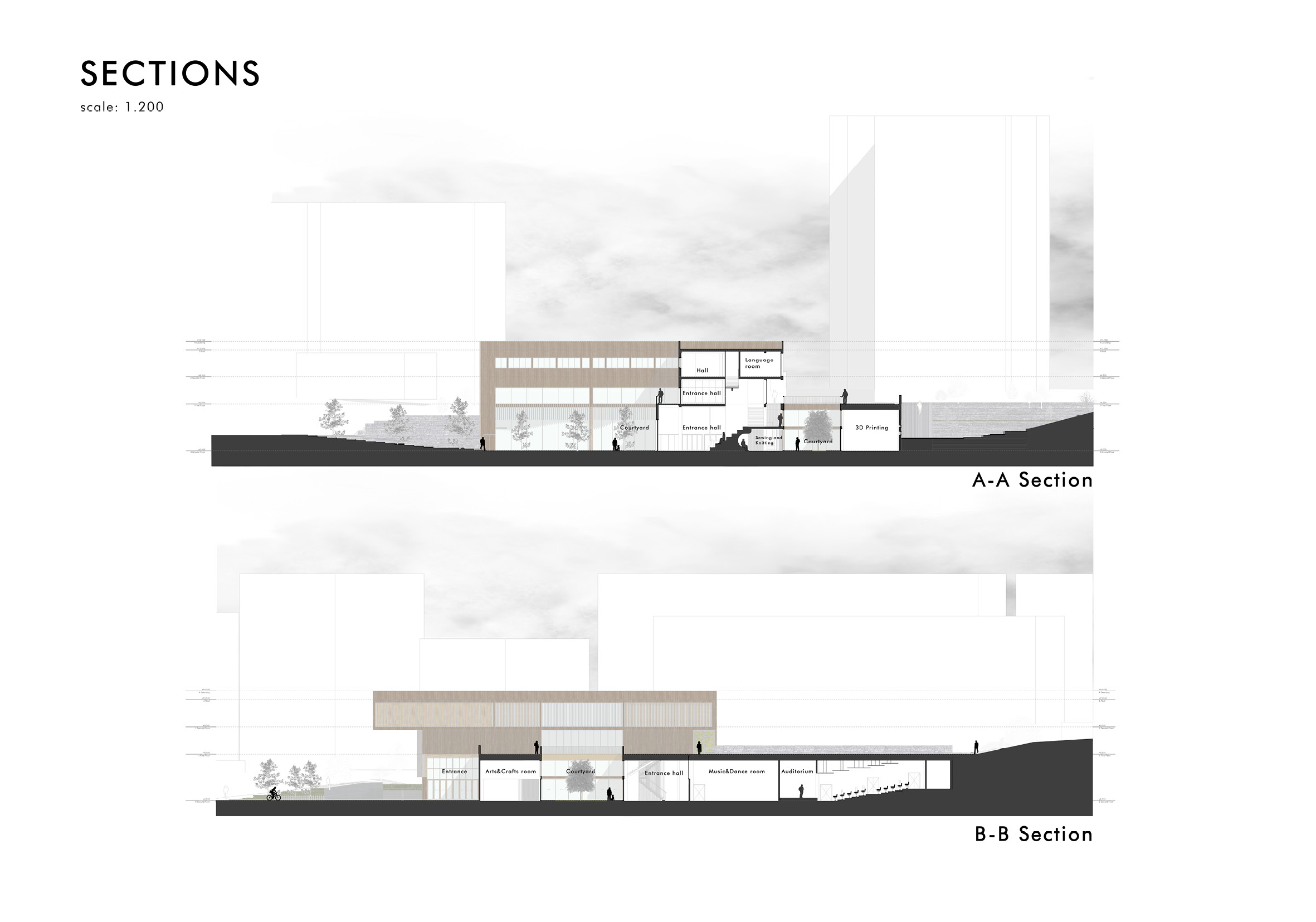
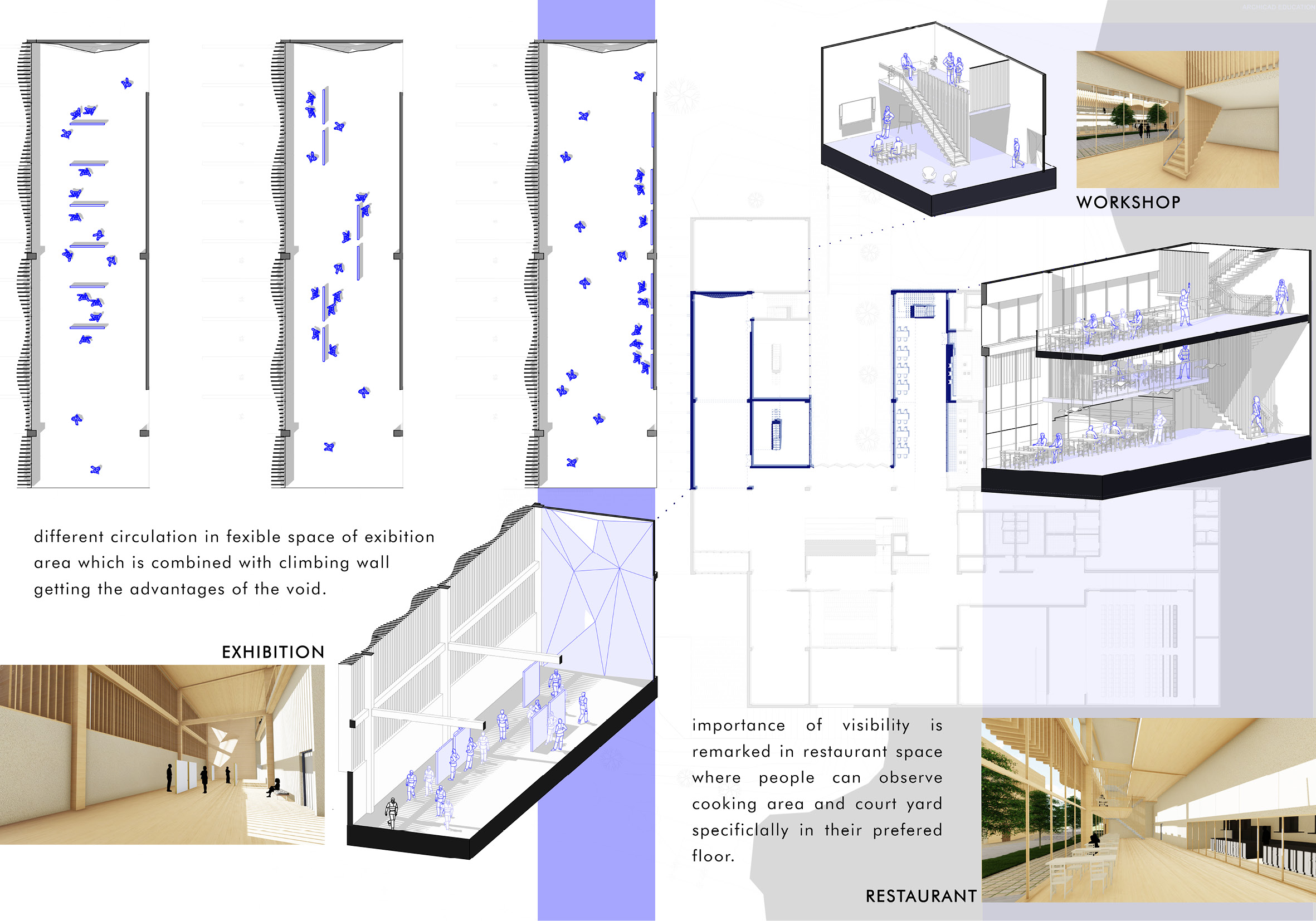
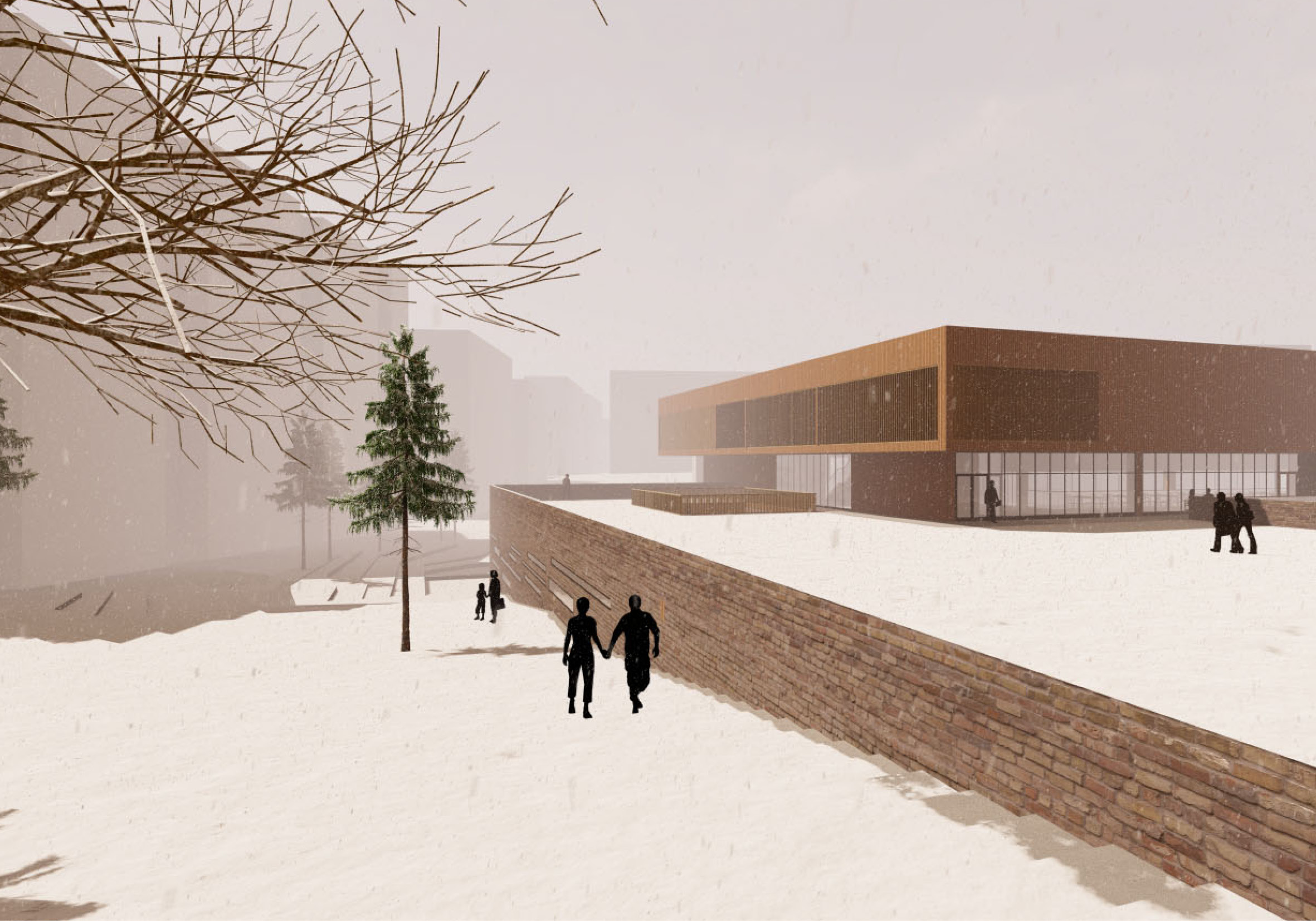
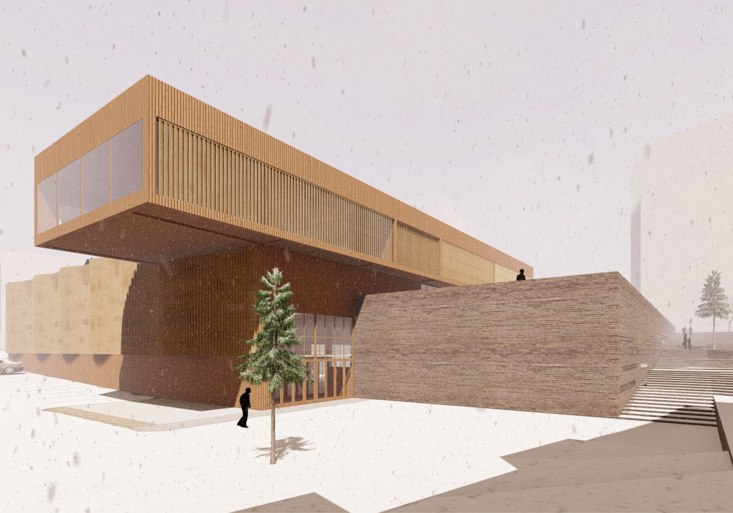
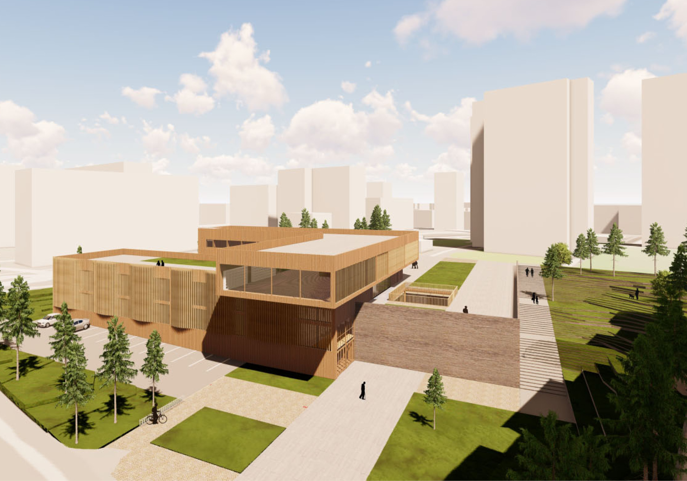
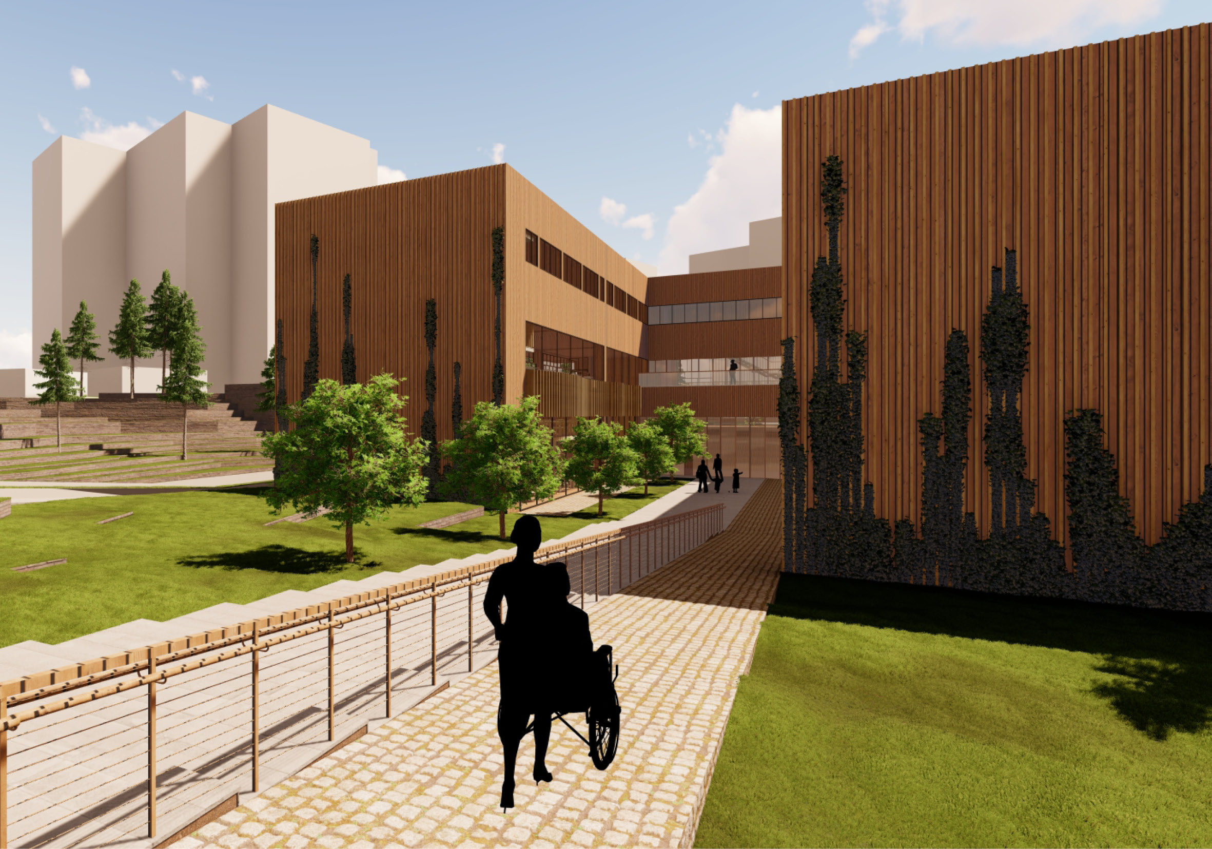
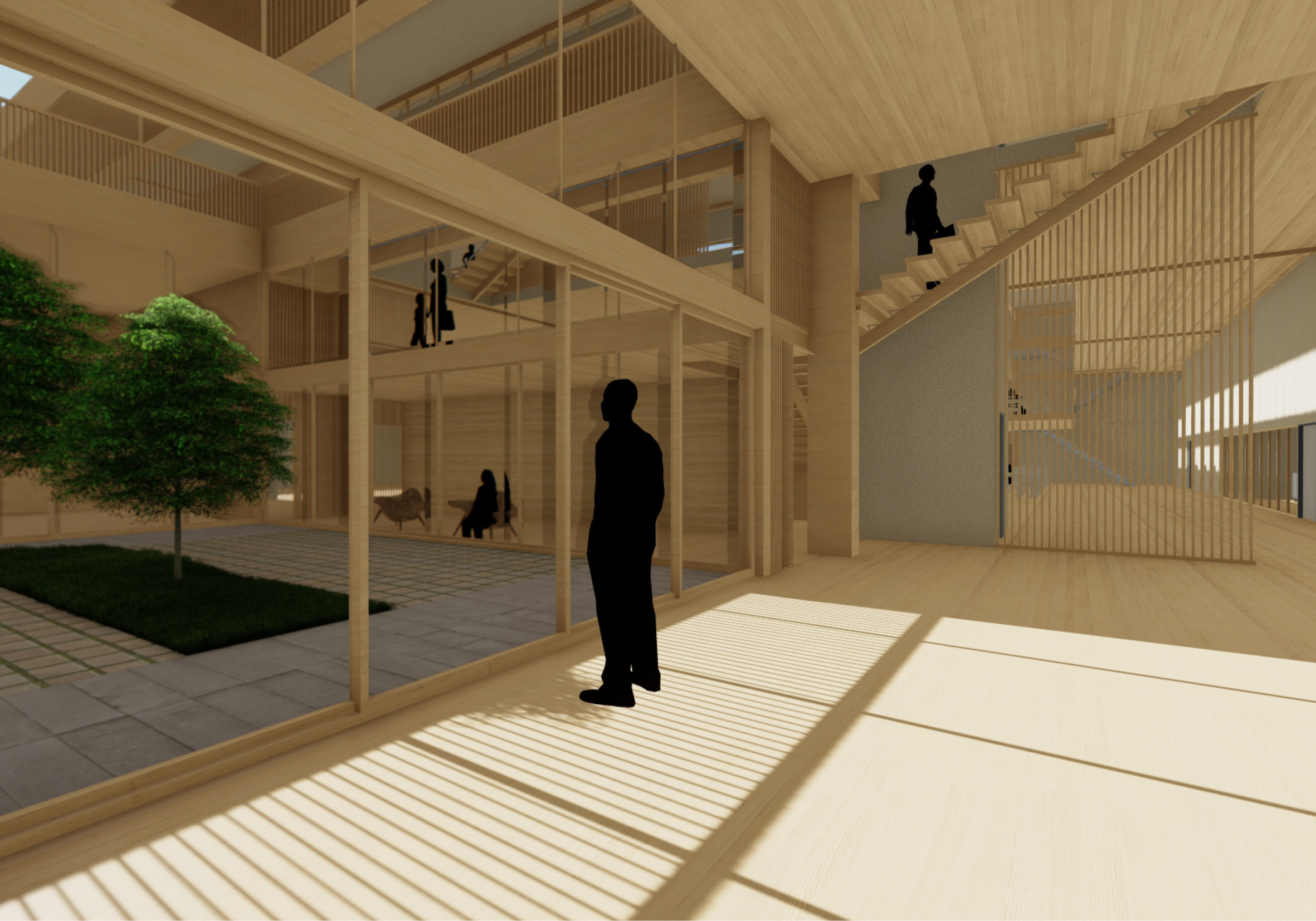
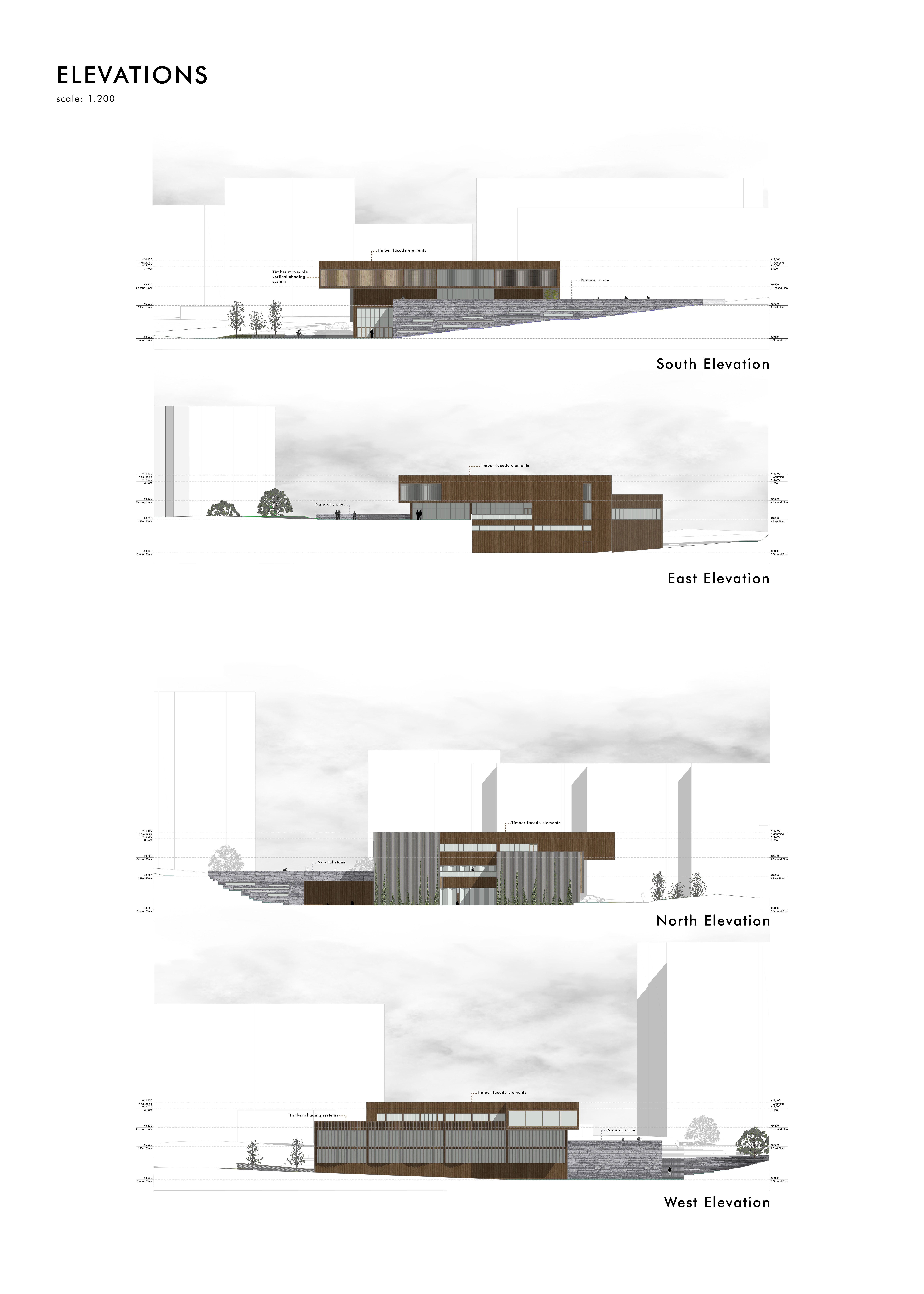
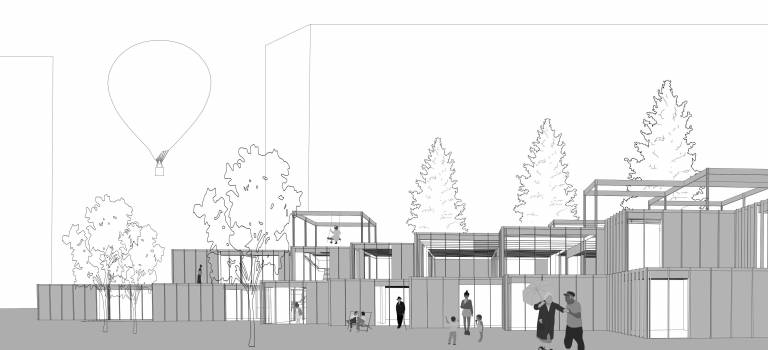
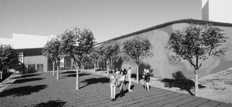
In the initial analytical phase of the project, we delved into a comprehensive examination of various site characteristics, encompassing accessibility, functionality, elevations, shading, topography, and vegetation. A remarkable discovery emerged from this meticulous analysis – a significant disparity in ground levels on opposite sides of the site. Moreover, we discerned visually captivating voids adorned with lush greenery in every nook of the site, an integral feature to accentuate in our design.
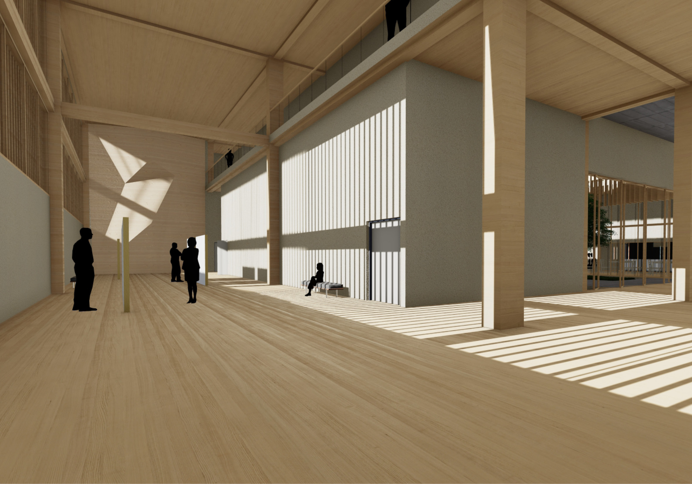
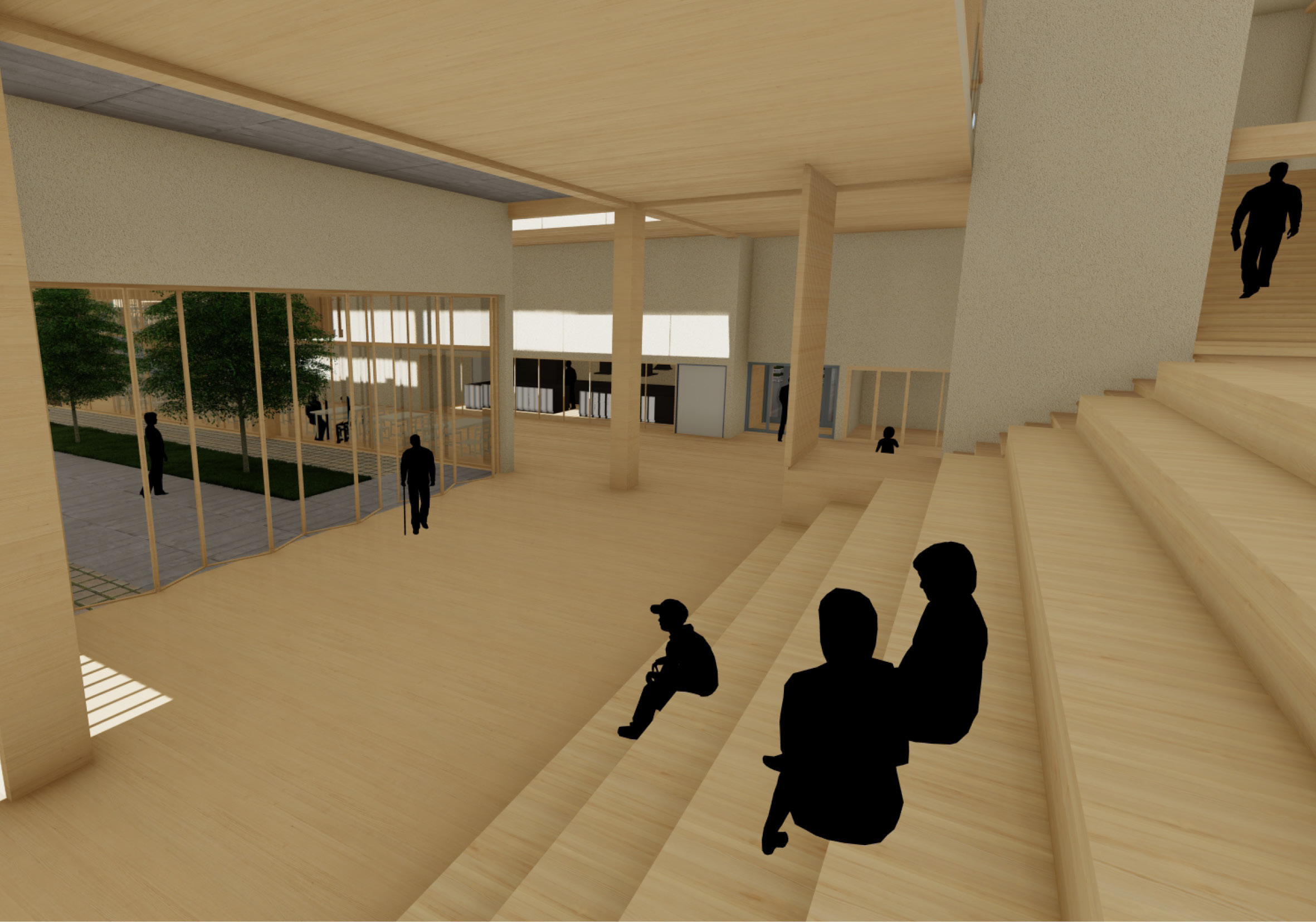
These observations assumed a pivotal role in shaping our design proposal. The project’s inception evoked a profound sense of nostalgia, as we reminisced about a place to which we felt a deep sense of belonging during our formative years. This introspective exercise enabled us to appreciate the significance of certain spatial qualities that could profoundly influence the user experience within various spaces connected to our design.
The design process unfolded through four distinct stages. Firstly, we grappled with the challenges of accessibility and ground-level variations within the site, employing 3D modeling to gain a comprehensive understanding of the terrain and surroundings. This visualization guided our decision-making regarding mass orientation, following the site’s bold lines and topography.
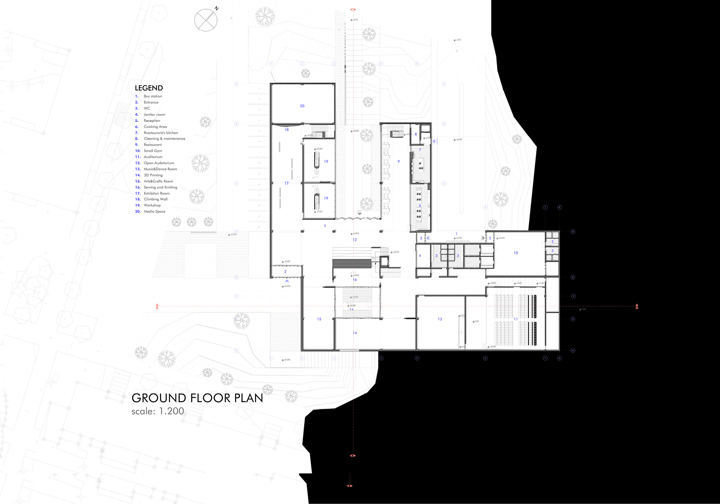
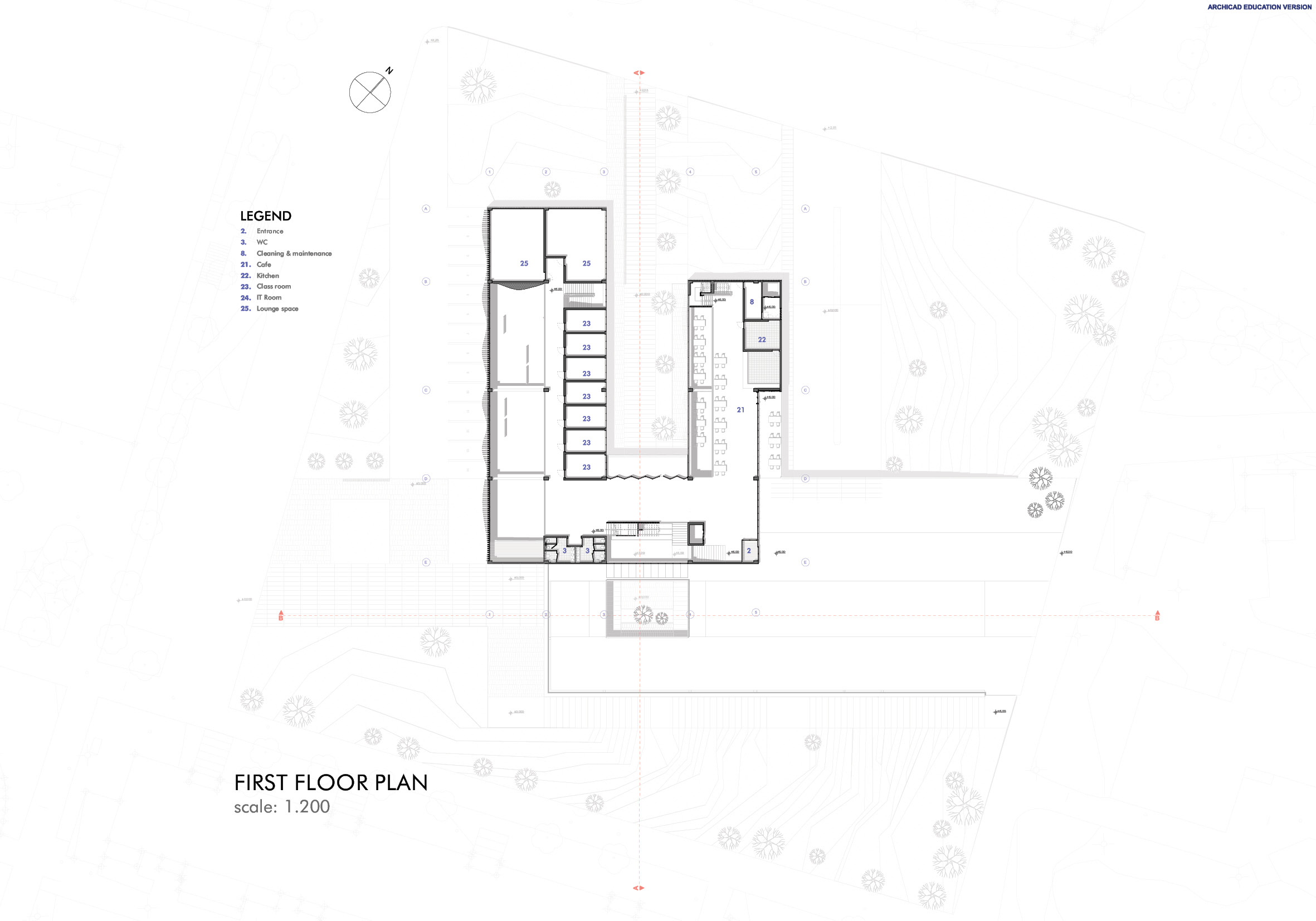
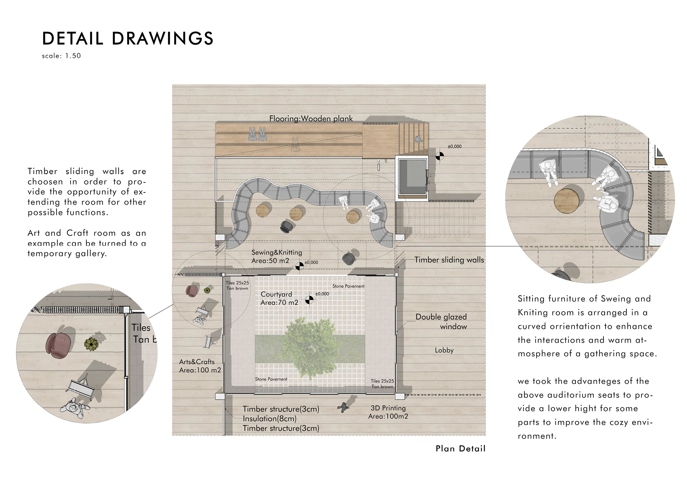
Our initial concept featured two solid masses, one responding to the elevated eastern side with its entrance, while the other served as the core, housing most functions and centralizing entrances. In subsequent phases, we reconfigured the core to improve northern access and expand the central courtyard. As we meticulously arranged diverse spaces, further changes to the core mass ensued, resulting in pronounced height variations within the previous U-shaped mass.
