All views expressed on this post are author’s own and do not represent the opinions of the unit, university or any other entity.
Some of the people faced with the problem of designing user interfaces that actually work for most people ended up inventing a new branch of science and engineering that relied on earlier findings in many fields such as the budding discipline of software engineering, cognitive psychology, factory production line design, and product design. They named the new field Human-Computer Interaction (HCI). Over the years HCI gained more and more prominence to the extent that it is now taught in almost all universities that have significant information technology or computer science departments. Recently, there have been sub branches such as service design that have popped up outside the traditional computing and engineering context.
Perhaps the most central approach taught in these programs to prospective product, service, system, and user experience designers is that the designer should look at the users – what they need and what they do – and design based on these findings. An equally important step is evaluation. That is, to ensure that efficiency, effectiveness, and satisfaction results when people are in contact with the system. If the evaluation results are not good, one must re-design – even if the users reject the designer’s brightest ideas.
In information systems it is important for users to be able to form a correct mental model of the information structures they are working with. Ideally, the system should utilize mental models that the users already have. This leads to minimal need to train users and is an easier path to effectiveness, efficiency, and satisfaction than many others.
The user-centered approach can be very effective. Facebook, Instagram, TikTok, and others such as many computer game companies have refined their designs to the point where people become addicted to their products. To addicted users these services are better and more interesting than the non-digital parts of their lives. This shows that we have come a long way from resisting users to users that desire to use software services to the extent that it interferes with their normal functions.
The half-century triumph of user centered design, however, has recently been challenged by Tampere University. For reasons unknown to the user population an approach reminiscent of the early days of computing has been adopted imparting the distinct feeling that we, the users of these systems are not welcome here. Because the systems do not support our tasks very well, it seems that they were made for somebody else.
The tuni.fi web user interfaces are in many places very difficult to understand. Either the user centered design process has failed spectacularly, or alternatively it has been tainted by other goals with higher priority that unsurprisingly have led to bad usability. Whatever the reason, It seems that tuni.fi has travelled a few decades backwards in time to a period when information systems were not built with the user’s needs and satisfaction in mind. Instead tuni.fi seems to prioritize brand promotion and conceptual re-education.
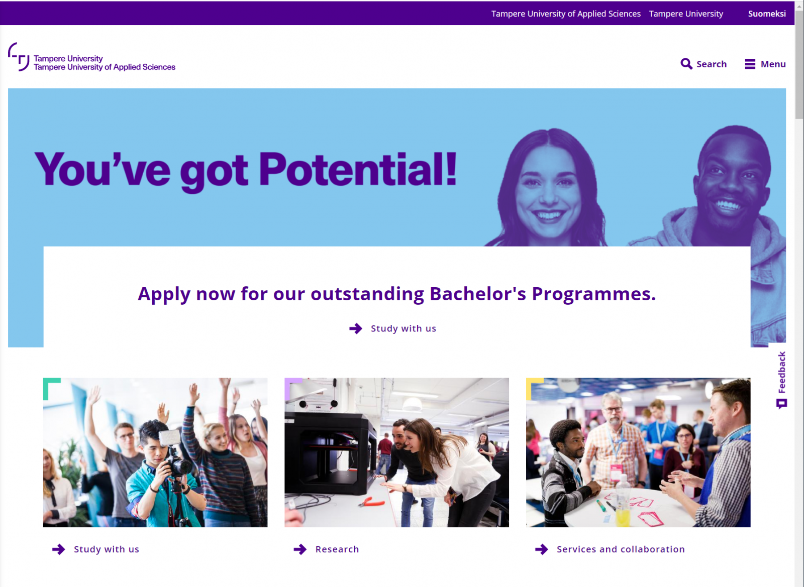
For example, a present or prospective student or a potential collaborator in education who wishes to understand what sort of education our university offers must first learn at tuni.fi that “You’ve got Potential”. Then (if the visitors’ display is big enough to show stuff under the huge un-informative pictures) they might guess that “study with us” is the appropriate link to click. Lower on the page there is “student’s guide”. No worries! Those who strayed to “study with us” will return at some point after figuring out that it may have been the wrong place to go to. Patient browsers might read this far on the first try. They can easily find the link if they are using a 4k display, or if they really like scrolling. On the following page they can now find the link to the curriculum, because everybody who is smart enough to deal with TAU has at this point already learned that the interesting stuff pops up after scrolling down past the material that is initially visible.
Alternatively, on the front page one can open a menu, which does not show anything interesting – unless the user is smart enough to figure out that the plus signs must be clicked. They had better figure it out because this is about as far as one can get on the website without understanding the importance of plusses. Plus, as we know, is a thing that must be clicked to reveal hidden things. Why they are hidden? Nobody knows. We must just accept that some things in life are hidden behind plusses and learn to love the plus clicking. After finally landing on the curriculum part of the students guide, the plus clicking skills better be good because now they are really needed.
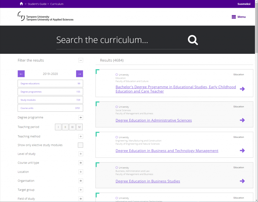
In the old days of user centeredness a curriculum section of the site might have had a listing of faculties that consisted of departments that offered degrees that consisted of courses arranged in blocks with clear names. A nice hierarchy that most people would comprehend and easily navigate. At tuni.fi such old fashioned concepts have been superseded by concepts of superior clarity, such as the difference between “degree educations” and “degree programmes”.
The curriculum page consists of a list of filters and a list of results. Sometimes the user can set the filters so that the needed items appear somewhere on the list of results (that thanks to the airy layout the list shows only 7 items on the 2160 vertical pixels on my display). Nicely enough the list of results list the same things many times. No way can the user understand what, if any, structure there is and whether the desired thing exists somewhere in the system or not. Many things do exist. The problem is the fight with the filters to reveal the thing you are looking for. Conventional user centered navigation concepts like “information scent” are useless. You just have to try and try again until you find what you are looking for – or give up.
Of course there is also the search field. One can, for example, think to start the search for a specific course by searching for all courses and then using the filters to narrow it down. Sadly this does not work. Search with “course” or the Finnish alternative “kurssi” returns a small subset of the “course units” that the system knows. Opintojakso as an alternative also does not work when written into the search field. However, the filter system shows that there are 3701 of them in the system when the word has NOT been entered in the search field.
An old HCI person like me feels like crying when using systems like this. Why is this? Is it because I am an old HCI person – this may be sad to begin with? Maybe. Or maybe it is because there is something wrong in the way that these systems are being designed.
Written by Poika Isokoski
PS.
(with an attempt at self-criticism)
Why express such negativity in the midst of building our new university? After all, the people involved in the process have admitted that the web is a work in progress and that many things will be fixed in the future. Why burden the process with yet another outsider complaint when well-intentioned and capable people are already working on it?
I am writing because I think that despite the good intentions, the web development processes do not seem to be progressing very well. Users of tuni.fi know of the shortcomings and are waiting for improvements. I am concerned that a year has passed and little has changed in terms of revising the fundamentals of the website design. Many little improvements have appeared, but it seems as if the main building blocks have remained the same. I believe that those blocks are not sufficient. It may be impossible to end up in a good system by re-organizing and polishing them.
The fundamentals that drive the process should be based on making the tuni.fi site easy and efficient to use. This may not be achievable with cosmetic improvements. The situation seems similar to a house that is falling down being met with an enthusiastic team of painters in the hope that a new paint job will fix it. Spending time on polishing the current design instead of recognizing the crisis and putting all efforts into finding a better design seems strange to me as an outside observer.
People spend time every week trying to find information that they know should be there, but cannot be found. In the long run this will be very expensive to the university (think of the value of all 40000 students and staff spending 5 minutes on web frustration every day). Attempts at communicating policies and procedures may fail simply because people cannot find the documents. To improve our position in comparison to other universities we need competitive advantages. The current web implementation is a handicap that slows us down.
I want to call for re-evaluation of the values that guide the tuni.fi web design. Is force-feeding brand more important than letting the site visitors get their work done? Is participation in the present web design fad of endless scrolling past big pictures and lots of empty space more important than showing the information that the reader is looking for?